
Exploring the Art of Asymmetrical Layouts in Web Design
In the ever-evolving world of web design, creating visually engaging and unique layouts is crucial for capturing the attention of users. One of the most effective ways to achieve this is through the use of asymmetrical layouts. Unlike symmetrical designs that balance elements evenly, asymmetrical layouts embrace imbalance and uneven distribution, resulting in a dynamic and visually stimulating experience. In this article, we’ll delve into the principles, benefits, and tips for creating compelling asymmetrical layouts in web design.
Understanding Asymmetrical Layouts
Asymmetrical layouts are characterized by an intentional imbalance in the arrangement of design elements. This doesn’t mean the design is chaotic or haphazard; rather, it is carefully planned to create a sense of movement, depth, and interest. The goal is to guide the viewer’s eye through the content in a natural and engaging manner.
Principles of Asymmetrical Design
To effectively utilize asymmetry in web design, it’s important to understand some key principles:
- Visual Hierarchy: Establishing a clear visual hierarchy is essential. This involves arranging elements in a way that guides users to the most important parts of the page first. Larger, bolder, or more colorful elements can attract attention, while smaller or subtler elements recede into the background.
- Balance: Even though the layout is asymmetrical, it should still feel balanced. This can be achieved by distributing visual weight across the design. For example, a large image on one side can be balanced by a cluster of smaller elements on the opposite side.
- Movement: Asymmetrical layouts can create a sense of movement and flow. By strategically placing elements, you can guide the user’s eye through the content in a deliberate path, enhancing the storytelling aspect of your design.
- Negative Space: Also known as white space, negative space is crucial in asymmetrical design. It helps to prevent the layout from feeling cluttered and gives elements room to breathe, enhancing overall clarity and focus.
Benefits of Asymmetrical Layouts
- Visual Interest: Asymmetrical layouts naturally draw attention due to their unconventional and unpredictable nature. This can make your design stand out in a sea of symmetrical and grid-based layouts.
- Dynamic Experience: The sense of movement and flow created by asymmetry can lead to a more dynamic and engaging user experience. This can keep users on your site longer and encourage them to explore more content.
- Expressiveness: Asymmetry allows for greater creative expression. It provides the flexibility to break the mold and experiment with unique compositions that reflect your brand’s personality.
- Focus and Emphasis: By strategically placing elements, you can draw attention to specific areas of your design. This can be particularly useful for highlighting calls to action, important messages, or featured content.
Tips for Creating Asymmetrical Layouts
- Start with a Plan: While asymmetrical layouts may appear spontaneous, they require careful planning. Sketch out your ideas and consider how different elements will interact with each other.
- Use a Grid System: A grid can provide a framework for your design, helping you to maintain some structure while allowing for asymmetrical placement of elements. You can deviate from the grid to create interest, but it serves as a helpful guide.
- Play with Scale and Proportion: Experiment with varying the sizes and proportions of elements. Larger elements can dominate and draw attention, while smaller elements can provide subtle details and support.
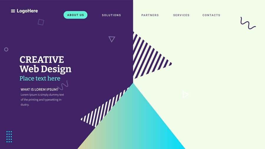
- Incorporate Overlapping Elements: Overlapping elements can add depth and dimension to your design. This technique can also help to create a sense of cohesion and connectedness between different parts of your layout.
- Embrace Negative Space: Don’t be afraid of leaving areas of your design empty. Negative space can enhance the impact of the elements that are present and prevent your layout from feeling overcrowded.
- Balance with Color and Texture: Use color and texture to balance your design. A bright color on one side of the layout can be offset by a textured or patterned element on the other side.
- Test and Iterate: As with any design, it’s important to test your asymmetrical layout with real users. Gather feedback and be prepared to make adjustments to improve usability and visual appeal.
Examples of Asymmetrical Layouts
- Portfolios: Many designers use asymmetrical layouts in their portfolios to showcase their creativity and stand out from the competition. By using varying image sizes, overlapping elements, and creative use of negative space, they create a visually engaging presentation of their work.
- Blogs: Asymmetrical layouts can make blog pages more interesting by breaking the monotony of standard grid-based designs. This can be achieved by varying the sizes of featured images, using different text alignments, and incorporating decorative elements.
- E-commerce Sites: Asymmetry can be used to highlight products and promotions in e-commerce sites. By drawing attention to specific items with larger images or bold colors, you can guide users to key areas and encourage conversions.