
Responsive and adaptive design are two crucial approaches in web development that aim to provide optimal user experiences across various devices. In an age where users access websites through smartphones, tablets, and desktops, understanding the differences between these two methods is essential for creating effective websites. This article will explore the concepts of responsive and adaptive design, their benefits, shortcomings, and which might be best suited for your particular needs.
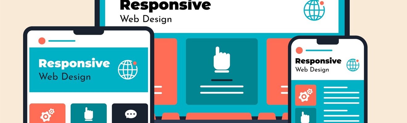
Understanding Responsive Design
Responsive design is an approach that utilizes a fluid grid layout, allowing elements of a webpage to resize dynamically based on the screen size. Essentially, responsive design ensures that a website adapts its layout to fit different devices, providing a consistent user experience. This approach relies on flexible images, CSS media queries, and proportions that adjust according to the viewport size.
One of the main advantages of responsive design is its efficiency. Since a single URL serves all devices, users and search engines do not encounter the complications of dealing with multiple URLs for the same content. This means that website maintenance becomes simpler, and there's less risk of content duplication issues affecting search engine rankings.
Moreover, responsive design provides a smoother user experience as users do not have to worry about page resizing suddenly as they switch devices. This fluidity encourages longer site visits, as the site is easier to navigate regardless of the device.
Exploring Adaptive Design
Adaptive design, on the other hand, utilizes fixed layouts and multiple versions of a webpage tailored for specific device sizes. When a user accesses a website, adaptive design detects the device type and loads the appropriate version of the site. This design approach often involves creating several layouts to target various screen sizes, typically desktop, tablet, and mobile.
The key advantage of adaptive design is its customization. Each layout can be uniquely designed for optimal user interaction on that particular device, catering specifically to users’ needs based on their screen size and capabilities. For instance, adaptive websites can implement touch-friendly interfaces for mobile users or take advantage of larger screen real estate on desktops.
However, adaptive design can introduce complexity. Having different URLs for various device layouts could potentially lead to SEO challenges, necessitating additional efforts in managing redirects and content duplication. Furthermore, the design complexity increases maintenance costs, as each version of the design needs to be updated separately.

Comparing Benefits and Challenges
When comparing responsive and adaptive design, several factors come into play, including user experience, SEO implications, development cost, and maintenance efforts.
User Experience
Responsive design generally provides a more cohesive user experience. Since it employs a single layout that adjusts seamlessly, users can enjoy uninterrupted navigation whether they are on a mobile device or desktop. The consistency also fosters familiarity, which can enhance usability.
Adaptive design, by custom-tailoring layouts for specific devices, can offer an optimized experience for each device type. This method can enhance the potential for interaction and engagement but may lead to inconsistencies among user experiences across devices.
SEO Considerations
From an SEO perspective, responsive design is often preferred because it consolidates links and reduces the risk of content duplication. Google advocates for responsive design, as it makes it easier for them to crawl and index sites. Conversely, adaptive design might require more attention to SEO practices to ensure that each device-specific page is effectively indexed and ranked.
Development Costs
Responsive design tends to require a more extensive upfront investment in development, as it involves creating a fluid layout and comprehensive testing across various devices. However, once built, it might reduce future costs related to maintenance.
Adaptive design may seem less labor-intensive at the start since it targets specific devices, but the requirement for multiple layouts can lead to higher long-term maintenance costs due to the need to update each layout independently.
Which is Best for Your Website?
Choosing between responsive and adaptive design ultimately depends on your specific needs, audience, and business goals. Here are some considerations to help make the decision:
- Target Audience: If your user base primarily accesses your site from a variety of devices, responsive design could provide a better overall experience. However, if your analytics reveal that users predominantly land from certain types of devices (e.g., mobile or desktop), adaptive design may offer more tailored interactions.
- Budget and Resources: Evaluate your budget and resource availability for development and maintenance. If you prefer a singular solution that may require less ongoing management, responsive design may be the better choice.
- Content Strategy: Consider the type of content you offer. If your website features interactive or specialized content (like gaming or graphic-intensive applications), adaptive design might better cater to those specific use cases to enhance usability.
- Future Growth: Think about your website's future. If you anticipate rapid growth or changes in how users access your content, a responsive design may offer a more versatile and sustainable solution.
